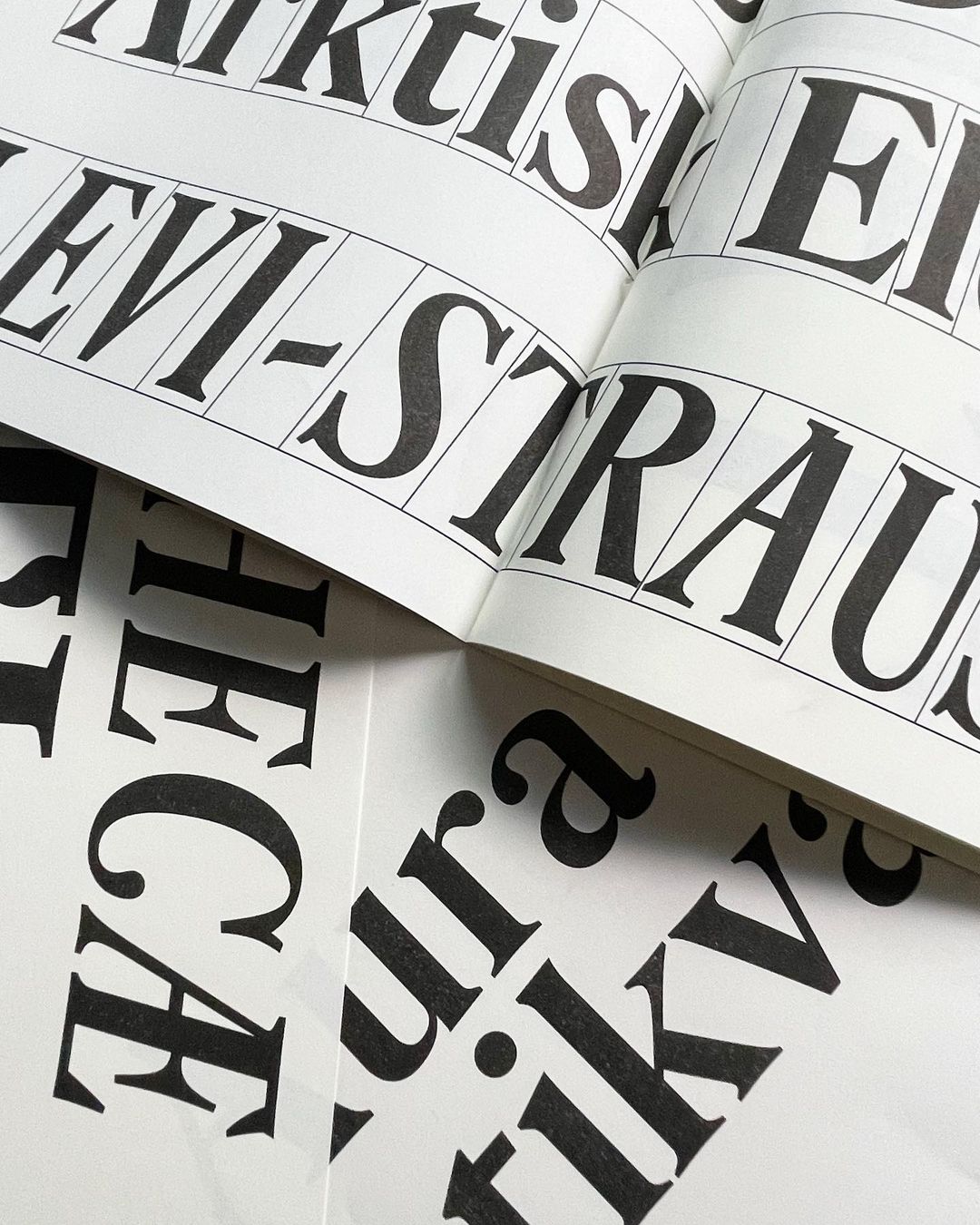
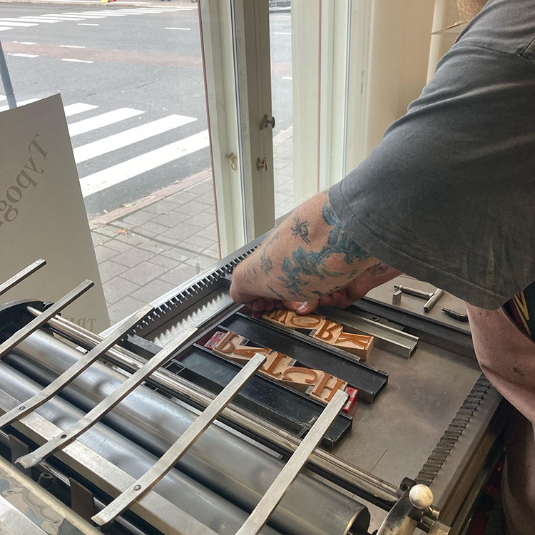
Aura Antikva
2023–25
Aura Antikva is a reimagination of some of the earliest Finnish printing types for contemporary use at the Letterpress House in Turku, continuing the lineage of the first Finnish press established in the same city in 1642.
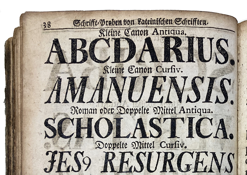
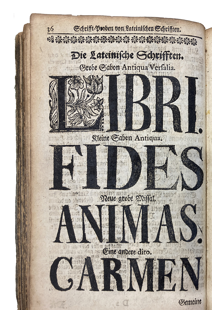
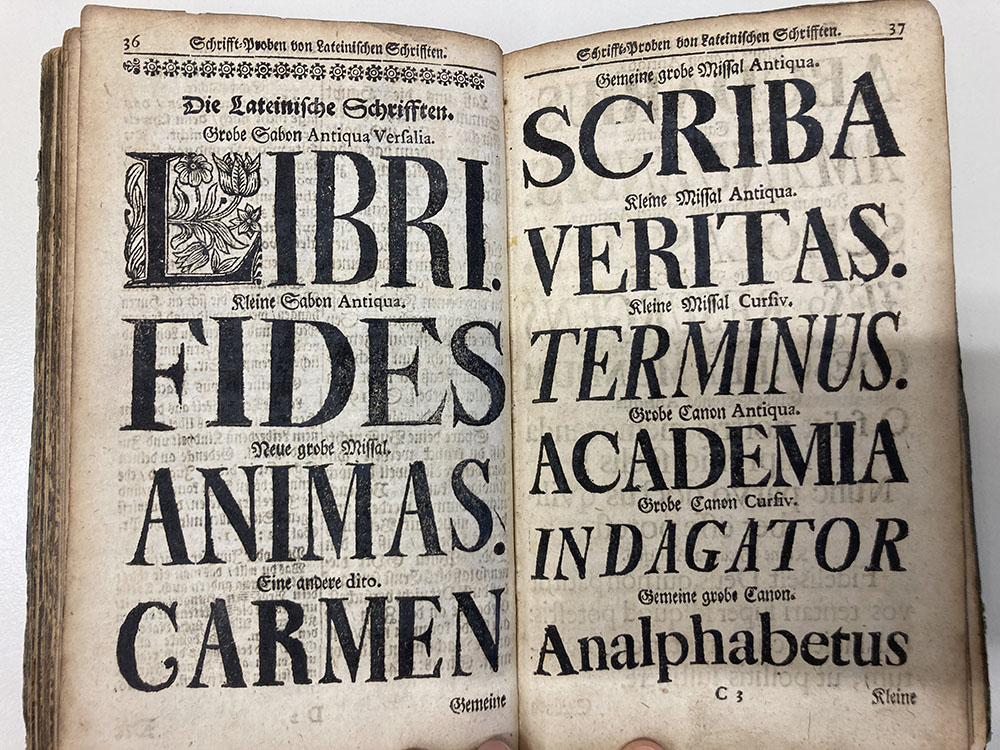
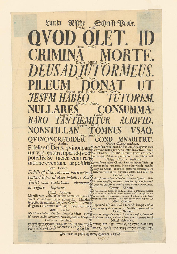
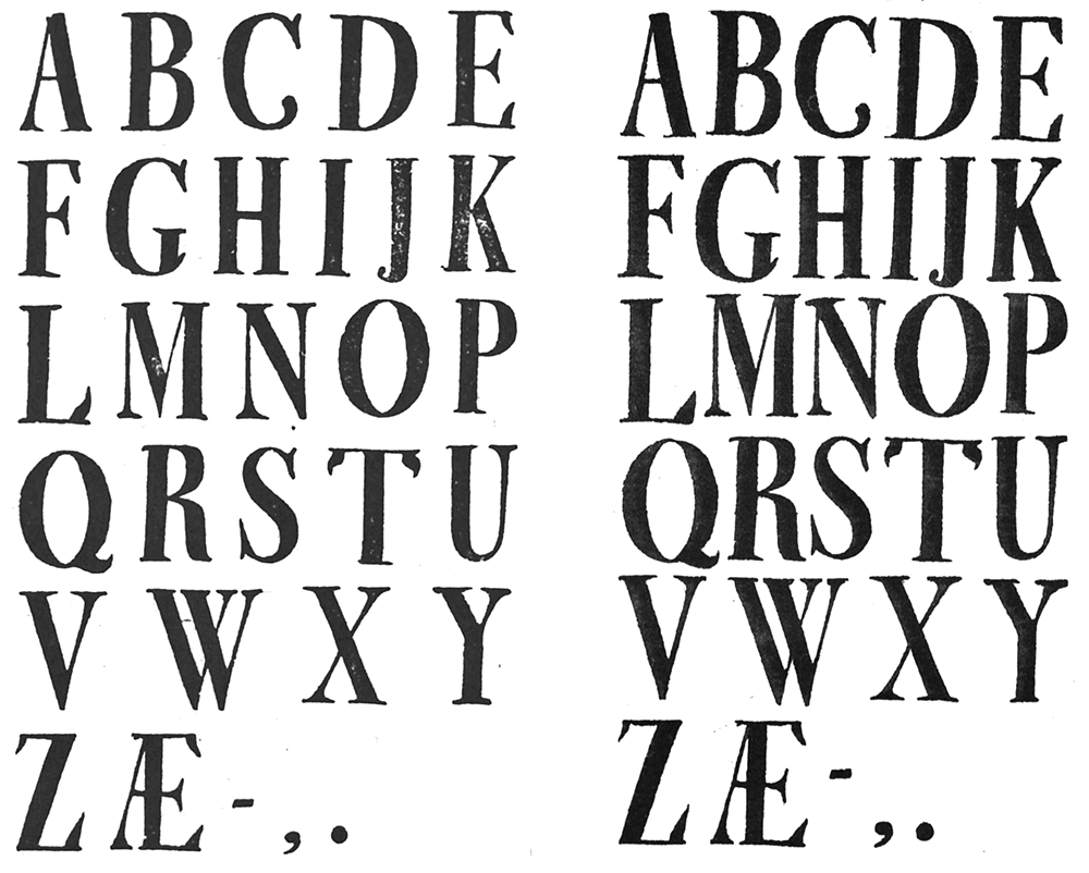
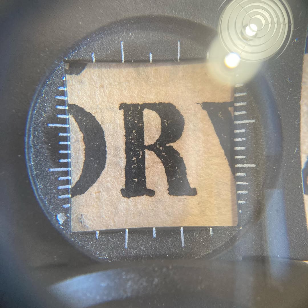
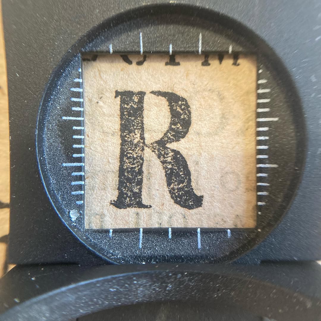
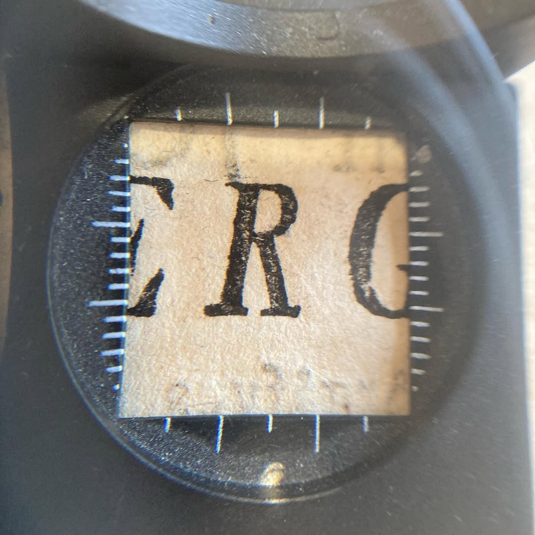
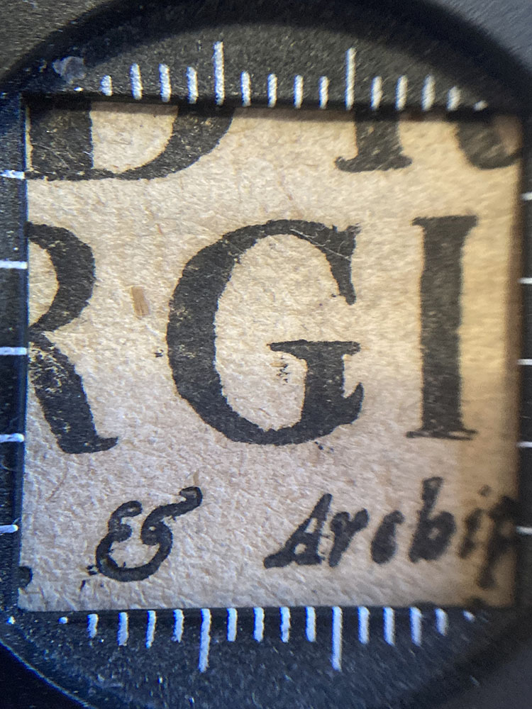
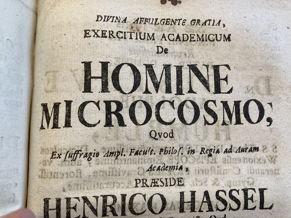
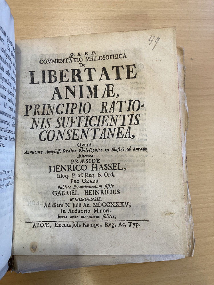
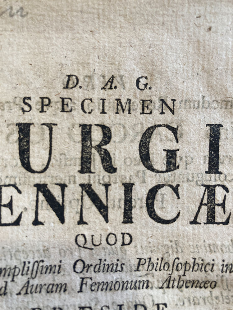
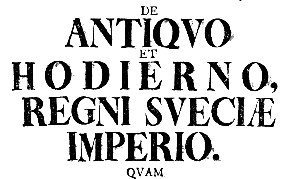
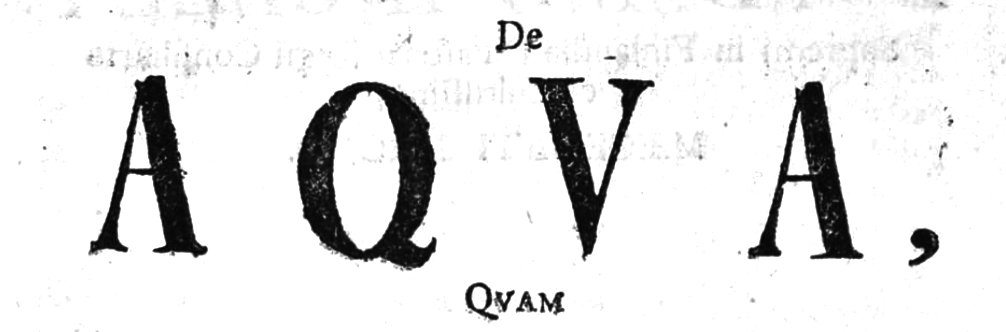
Around 1704, a set of crude capital letters were carved in wood by Lübeck printer Johan Nicolaus Thun and subsequently transferred to matrices for casting by the local type founder Jobst Rüdemann. Thun’s typeface saw modest success in Germany, but found a market among Scandinavian printers. Its use can be traced in printer’s specimens and output throughout Scandinavia. It spread through Denmark, and Sweden, and eventually arrived in Turku in 1729 – initially as hand-me-downs from Swedish printers (likely hand casted in Sweden), but later resupplied directly from Lübeck by boat.
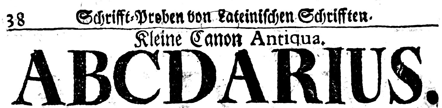
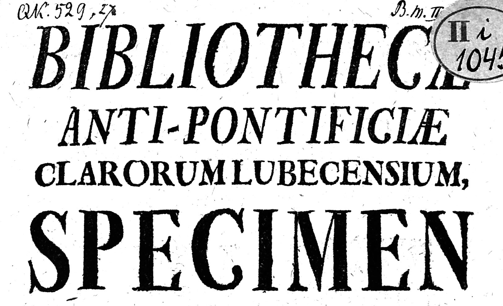
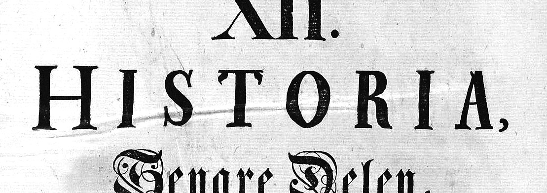
The typeface was widely used in the printed dissertations produced at the Academiæ Aboensis until around 1770. In 1827, the university printing press and all its material was lost in the Great Fire of Turku. The last printer’s specimens, produced just a few years before the fire, still list Thun’s type. After the fire, the Finnish capital was relocated to Helsinki, ceasing all print production in Turku.
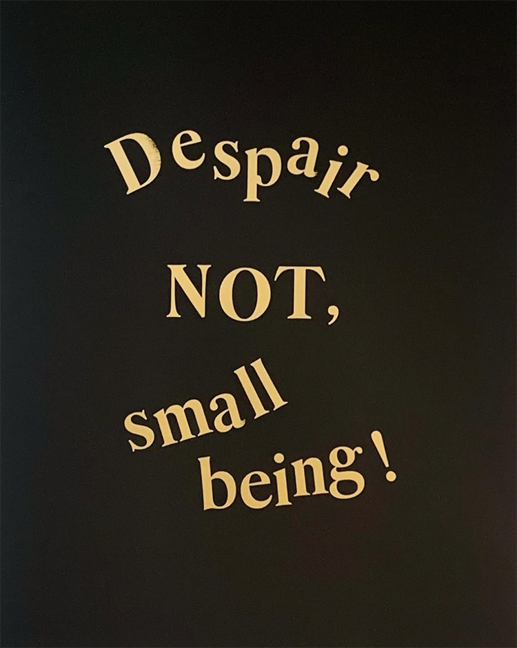
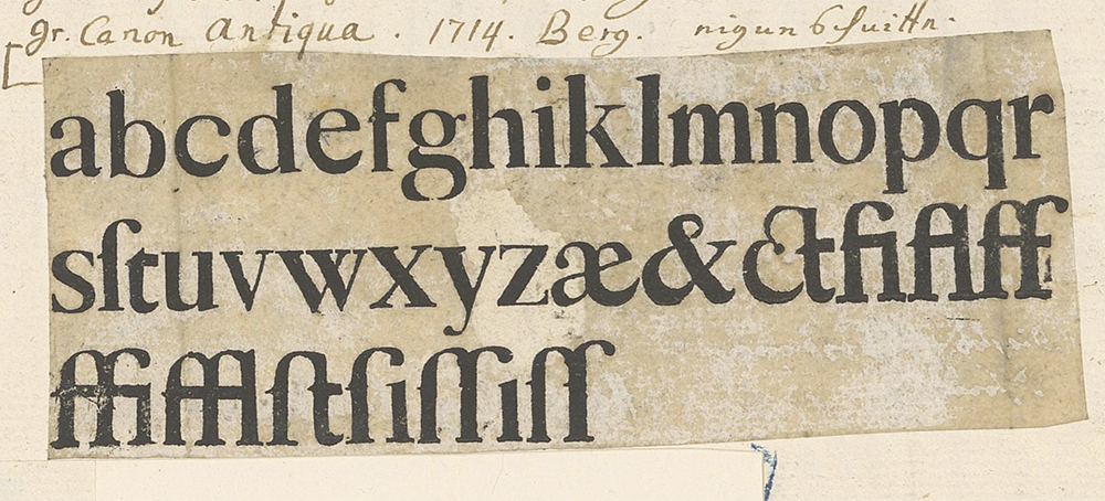
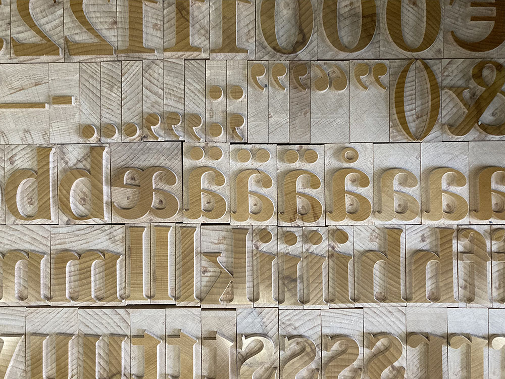
The revival distills a number of discordant sizes down to a manageable set of three: titling needs are covered by sizes twenty-four and twelve cicero (the latter with lowercase and italic caps), and a sixteen point text companion rounds out the set. The lowercase, which is missing in Thun’s types, was developed for the two smallest roman sizes, referencing a set of minuscules by Hermann Berg – a contemporary of Thun.
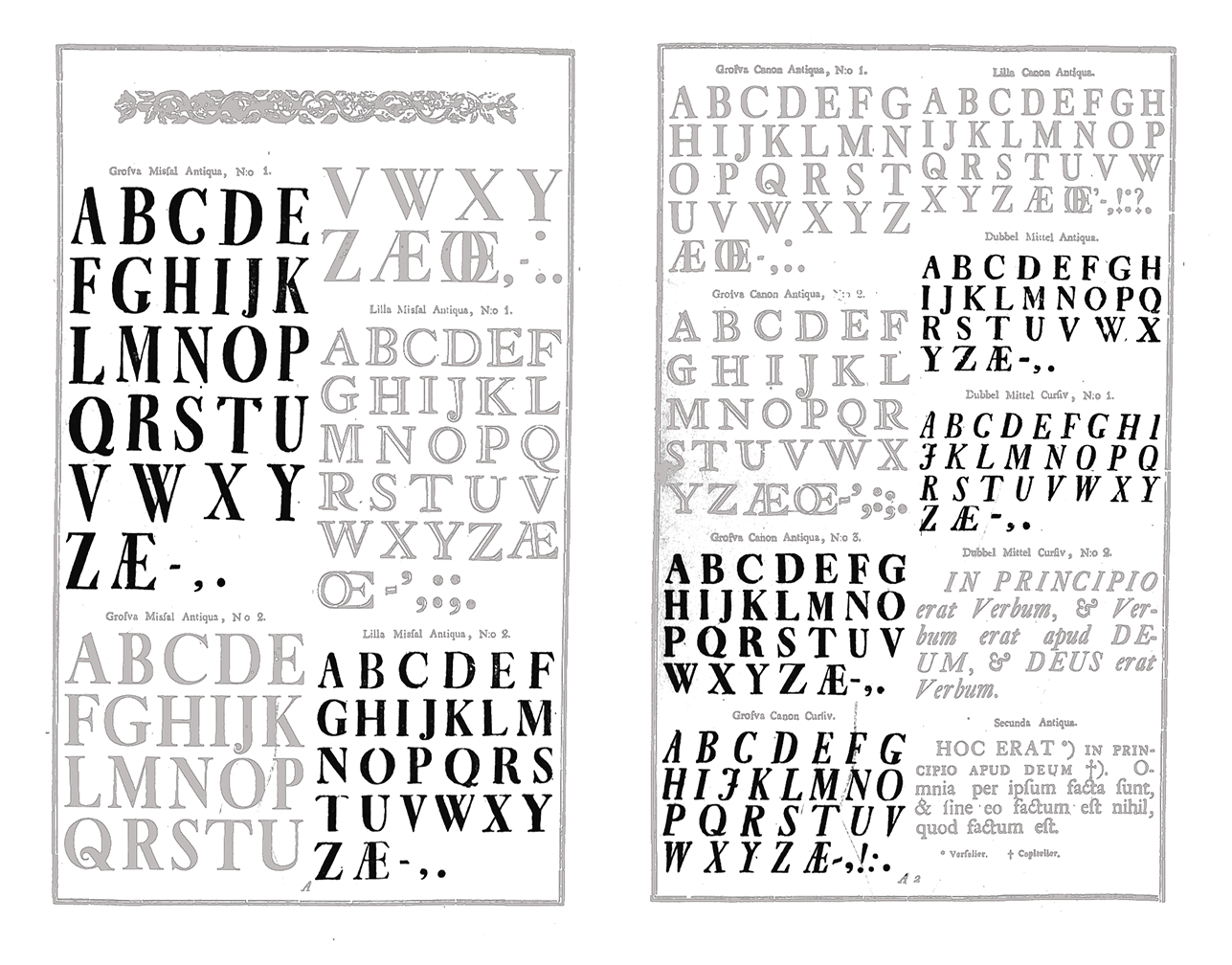
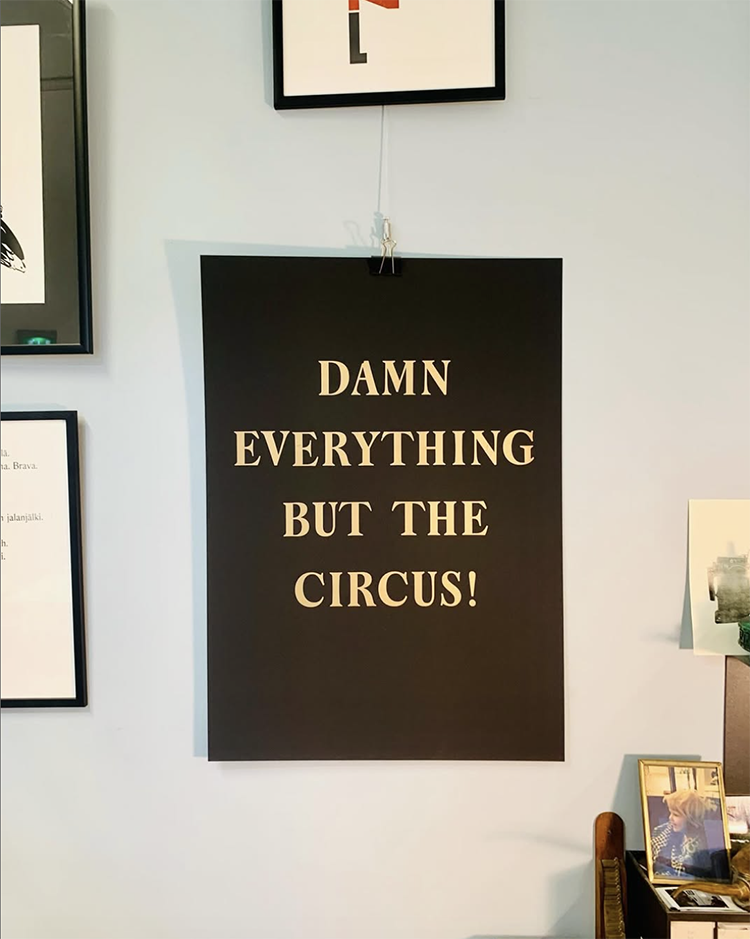
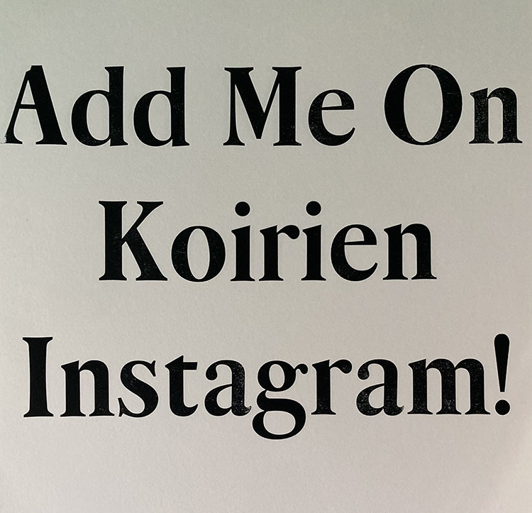
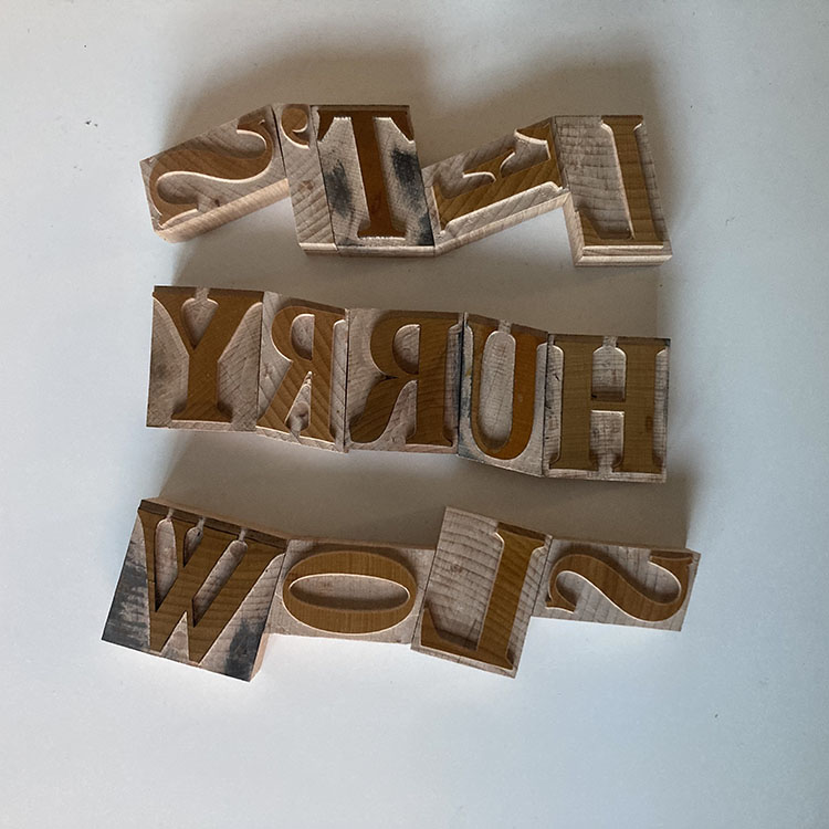
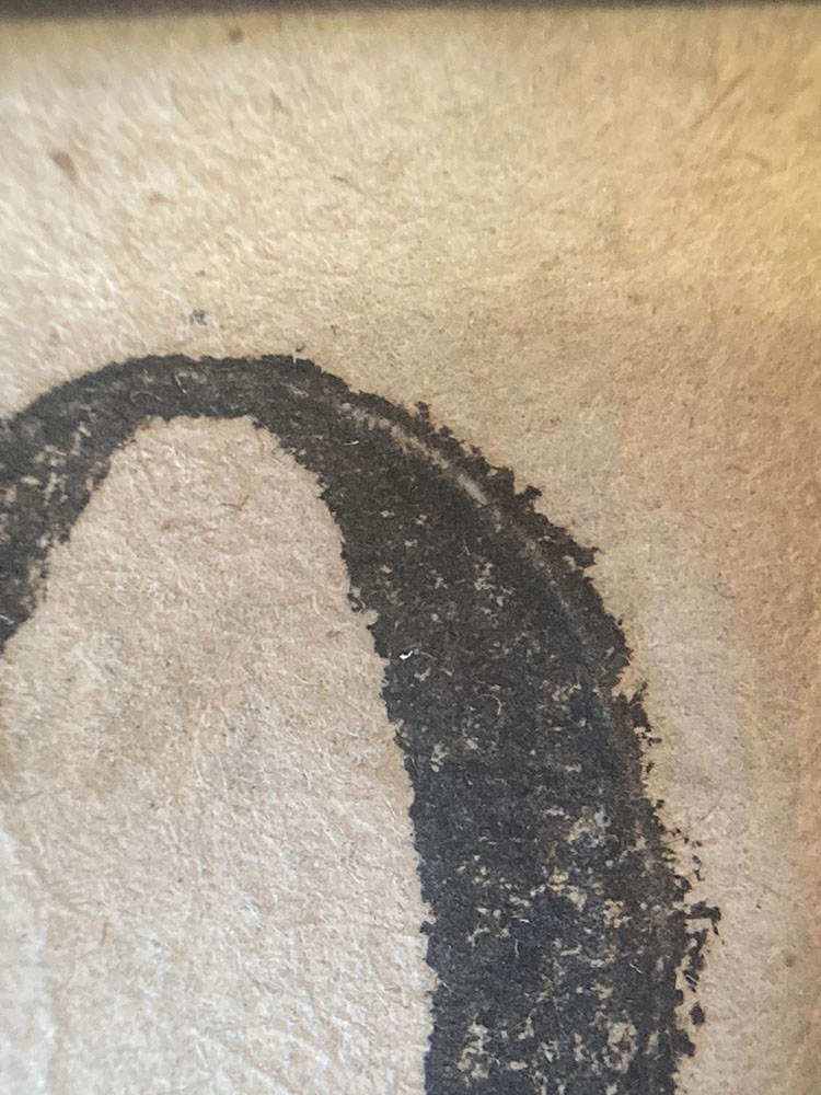
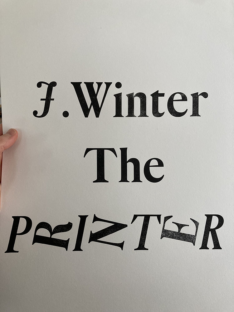
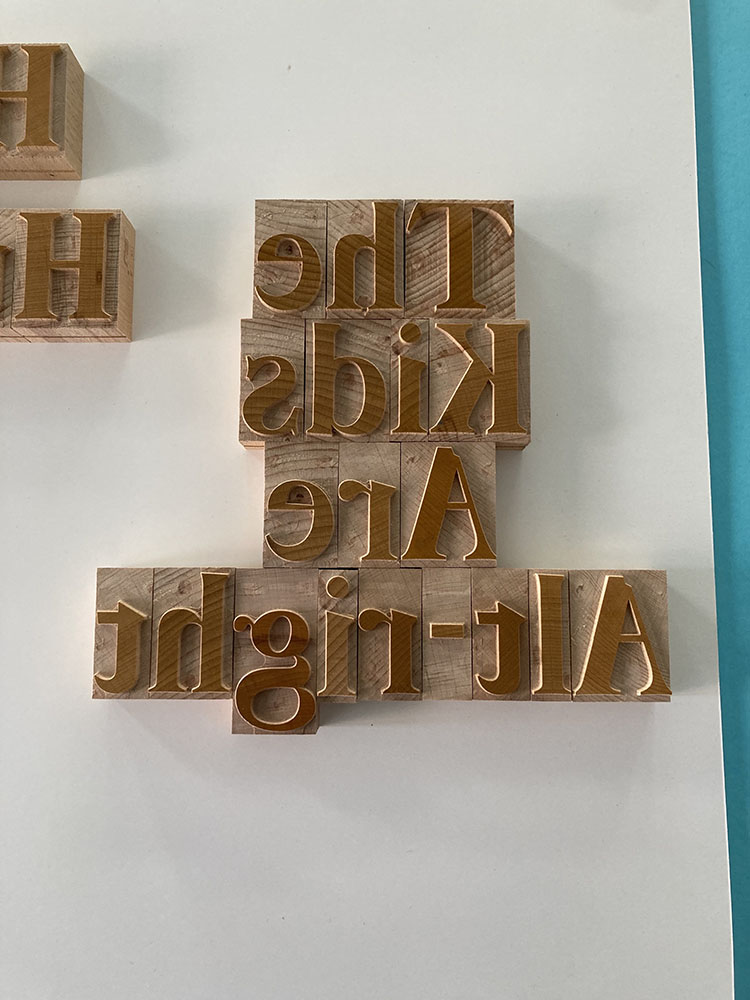
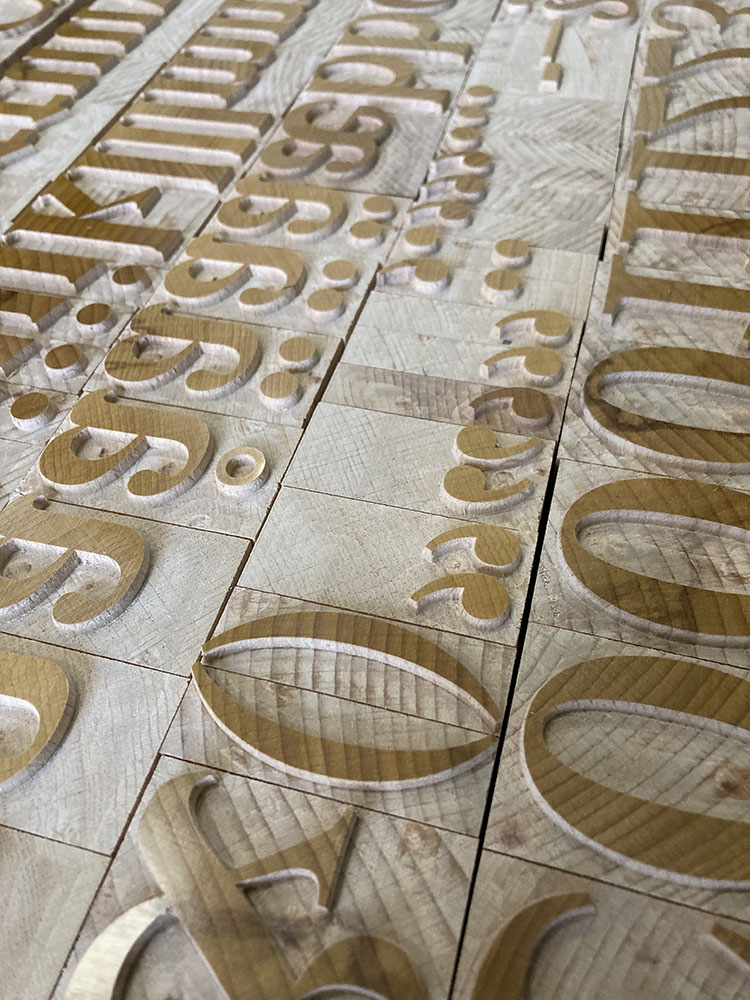
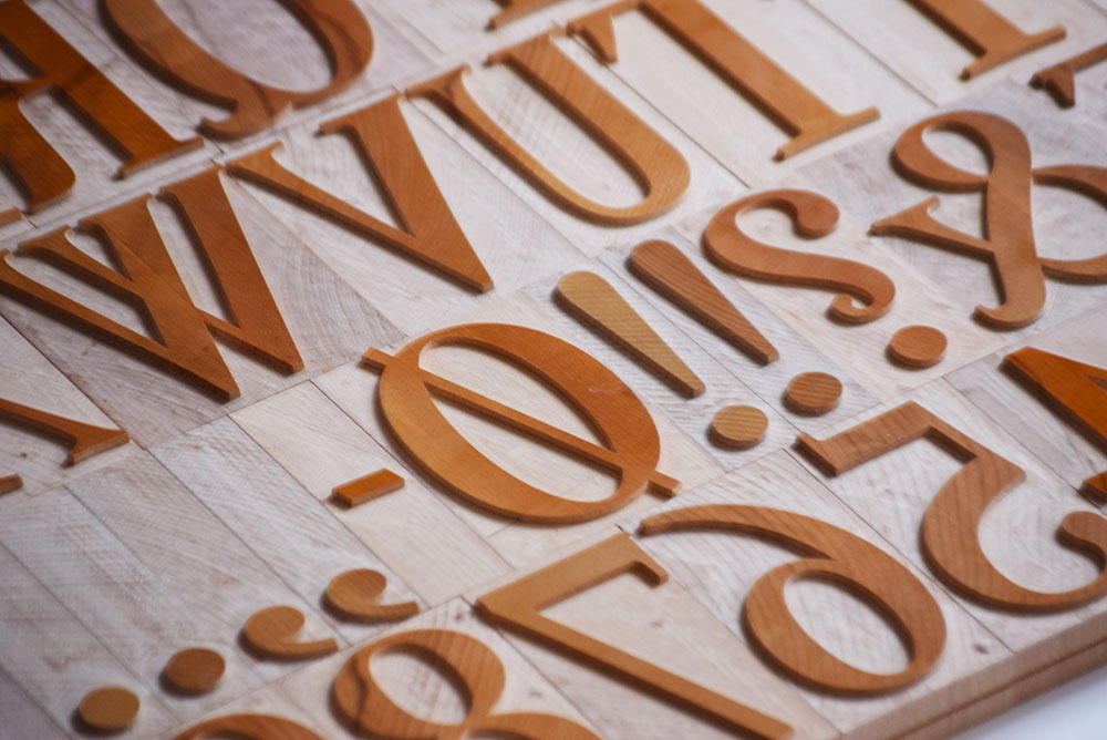
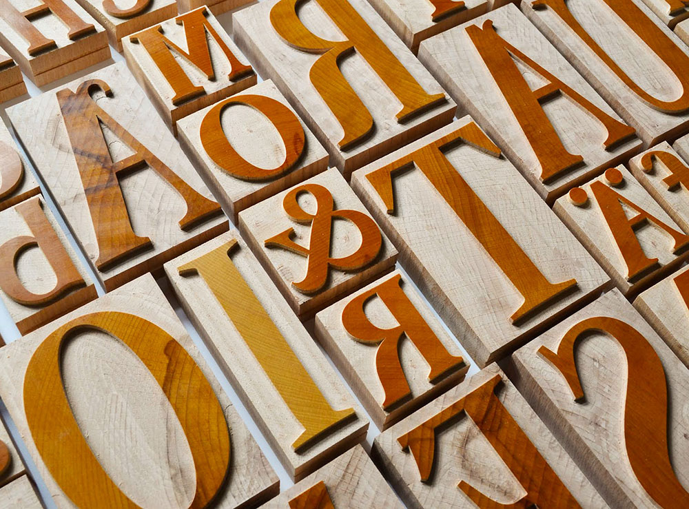
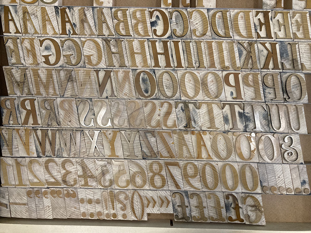
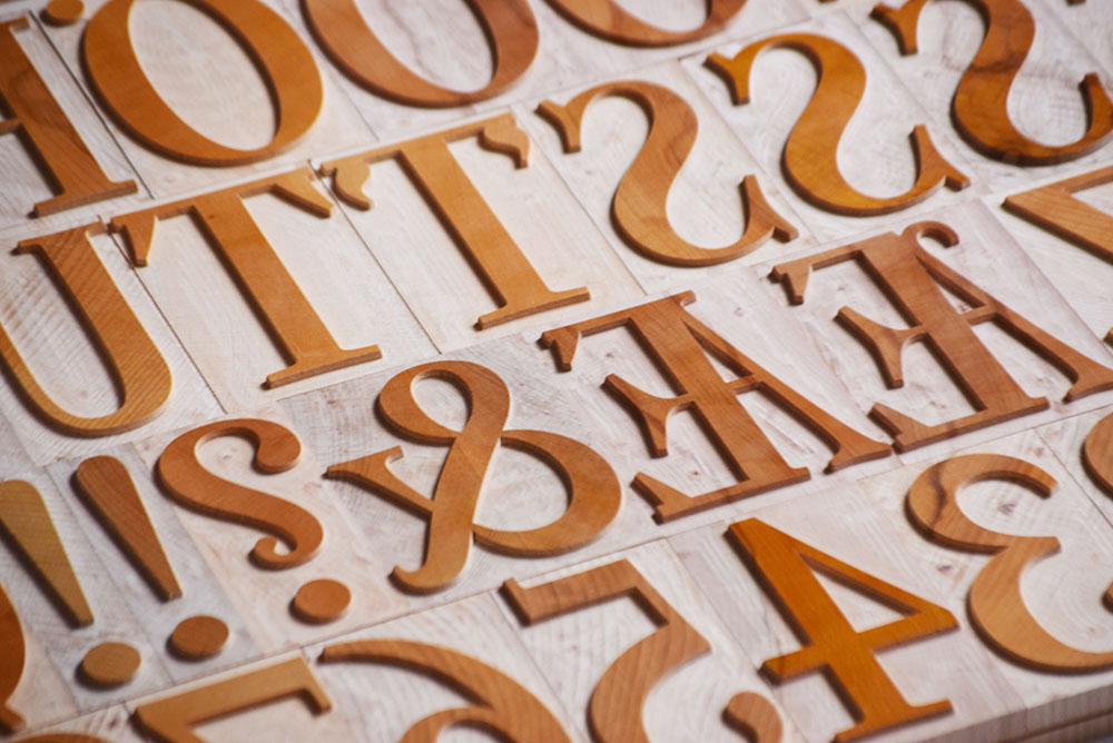
Thun’s design is marked by Baroque mannerisms: The letters are equipped with double-sided serifs, split endings, and ornate detailing. The most dramatic and recognizable detail is the decorative leaf-like serif found in the largest sizes.
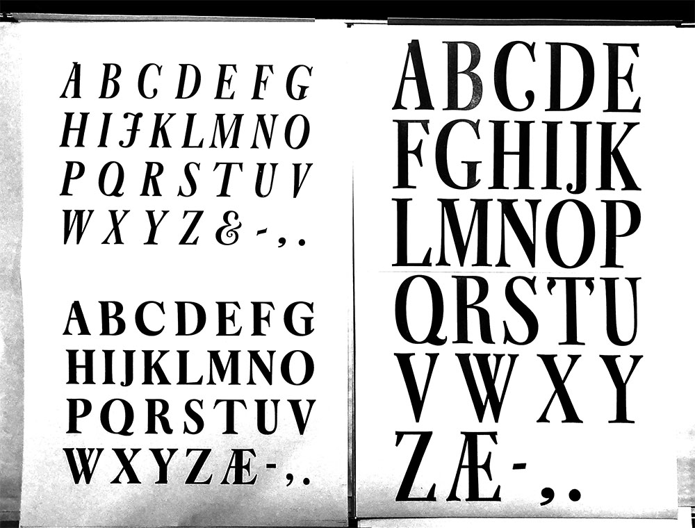
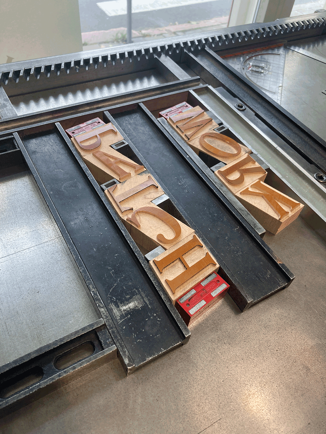
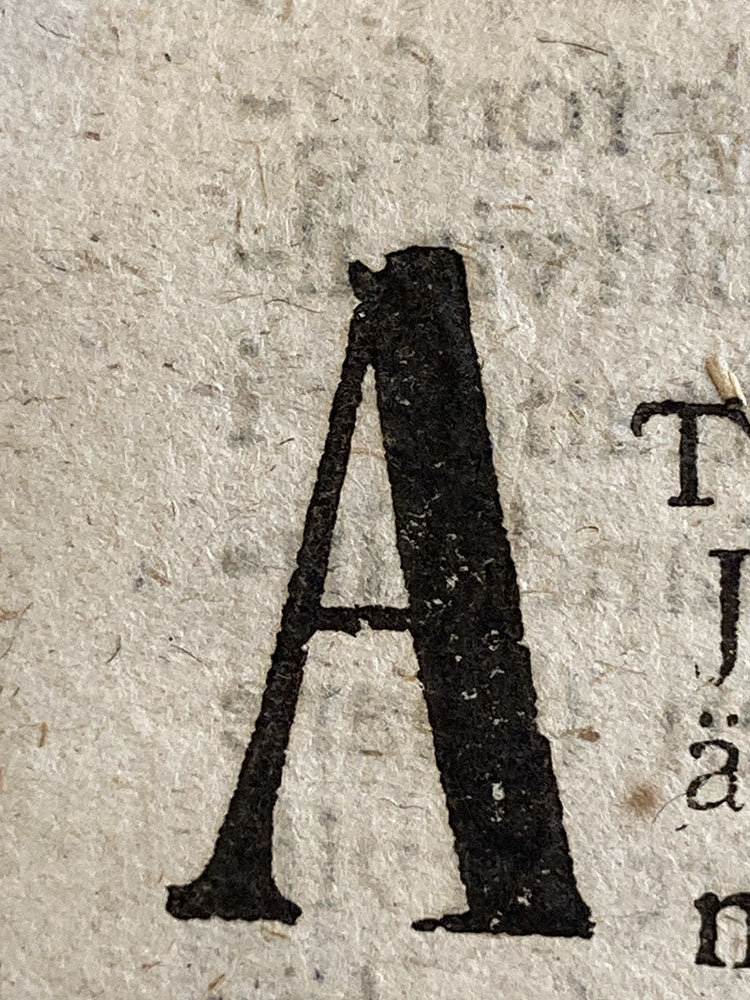
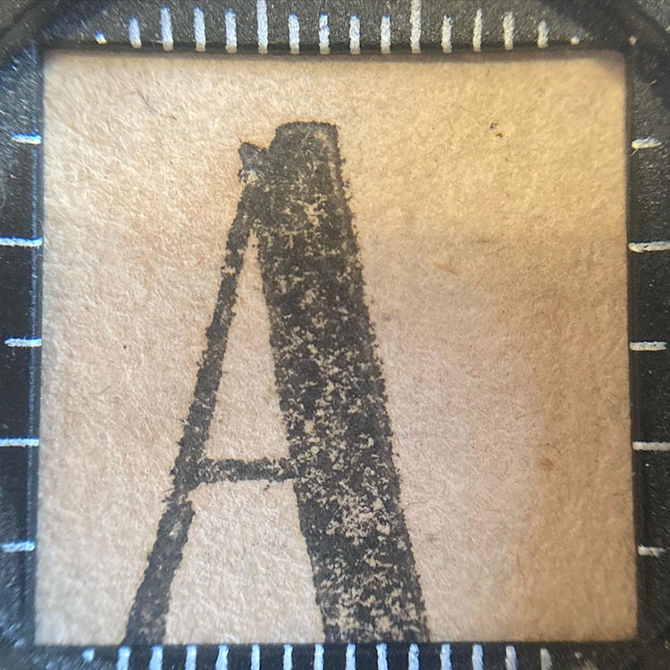
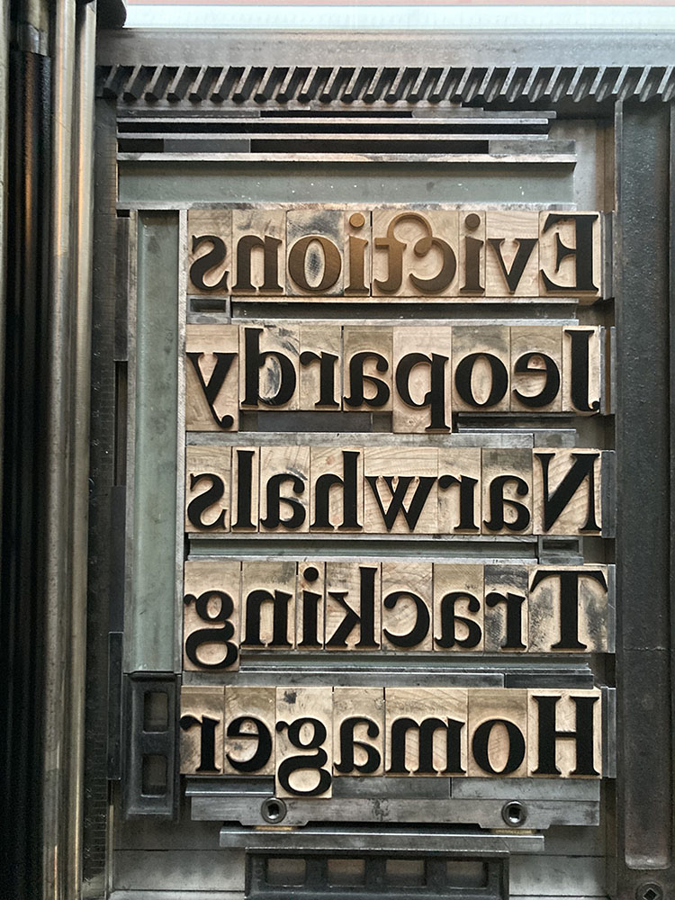
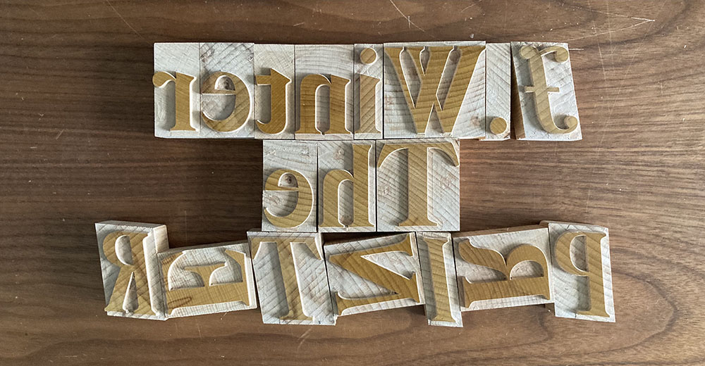
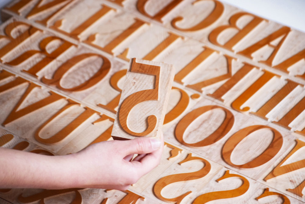
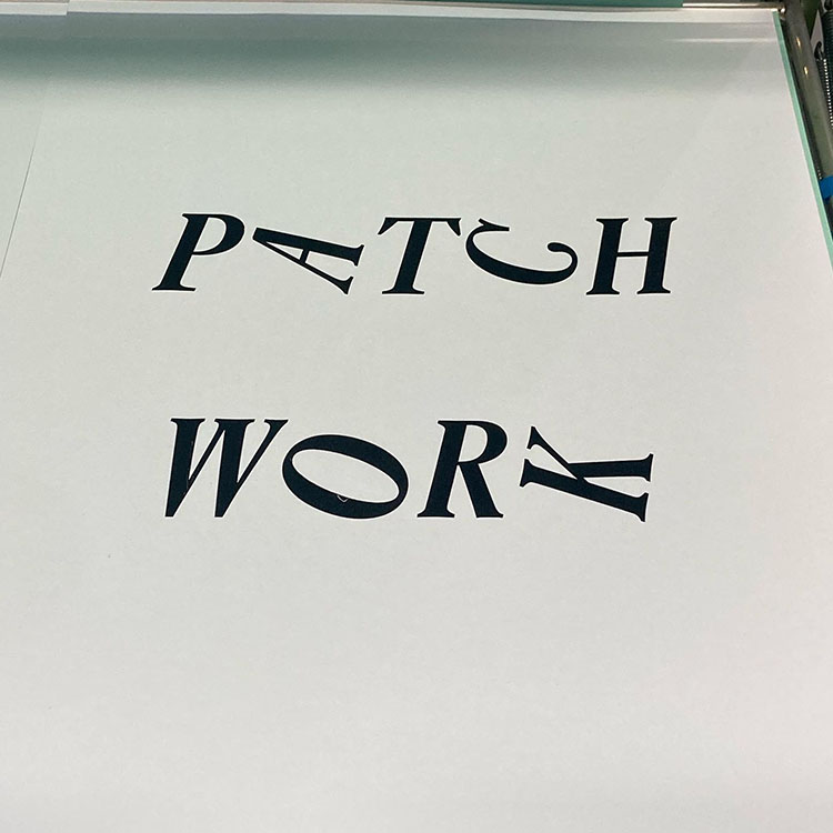
The Turku Type Revival is not a revival in the strict sense. Aura Antikva is doubly transposed – from the book page to large scale display typography, and from metal to wood. Hidden among the characters are material imperfections and artefacts that don’t belong in any digital drawing. The typeface contains elements of fiction, like the ornamental details borrowed from one-off wood cut lettering, or the new lowercase that only loosely references historical sources. Where the original design hinted at contemporary trends, the course was consistently plotted in the opposite direction. The digital drawing is a deeply personal interpretation, emerging from Helland and Männistö’s conversation.
Aura Antikva embraces the Turku vernacular as an amalgamation of external influences and local penchant, resisting a homogeneous modern curation of visual features, and insisting that the wood types should be well-worn before any digital fonts are distributed.
The new typeface is infused with playful experimentation and defiant attitude. It is named after the river Aura that runs through Turku, connecting paper mills and print shops, and also providing the trade route to Europe.