Project
About the Turku Type Revival
Design trends reach peripheries like Turku with an implicit message: Status is attained by dismissing your own and by adopting the urban monoculture.
Traversing Northern Europe on an Interrail ticket during the summer of 2022, type designer Frode Helland happened upon Sakari Männistö – a tall, bearded, letterpress printer from Turku. The chance meeting developed into a friendship, and eventually resulted in an artistic collaboration.
The Turku Type Revival started its life as Helland’s master project at the Oslo National Academy of the Arts in 2023, developing a new printing font for Männistö’s Letterpress House.
A continuation of the historical Finnish printing tradition
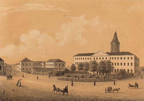
As the pair started researching the local typographic history of Turku, they soon discovered that the first printing press to establish in Finland was located merely a stone’s throw from Männistö’s workshop: The Regia Academiæ Aboensis printing press, founded in 1642, remained in operation until the Great Fire of Turku in 1827, when it relocated to Helsinki.
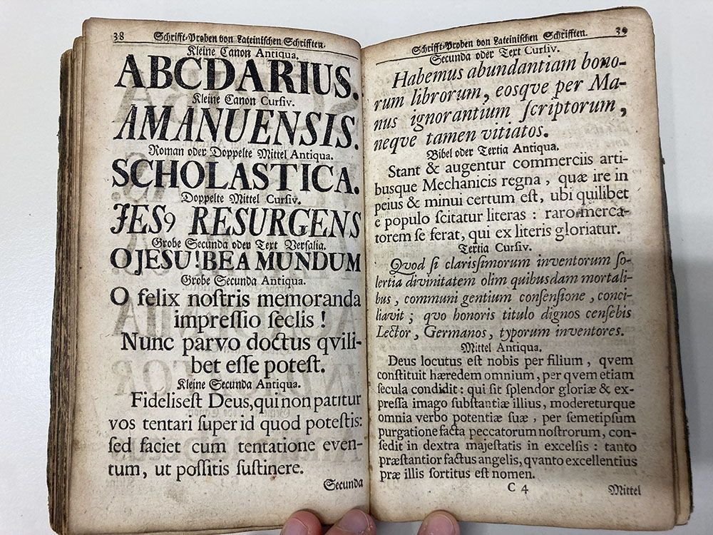
Among the historical letterforms employed by the early Turku printers, a set of large, bold, and ornately detailed capitals caught their attention. These letters were well suited to bridge the time gap, and also able to handle most functional needs of contemporary letterpress printing. With the help of Krefeld-based design researcher Daniel Reynolds and the Gutenberg Museum in Mainz, the capitals were traced back to their origin in Germany, around the turn of the 18th century.
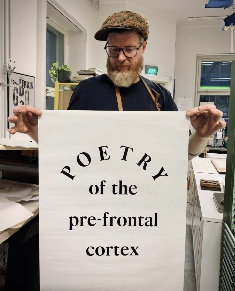
Männistö’s techniques and machinery are basically the same as those of the early Turku printers – now, so are also his letterforms.
On the surface level, the Turku Type Revival is a continuation of the historical Finnish printing tradition: Männistö’s techniques and machinery are basically the same as those of the early Turku printers – now, so are also his letterforms. This gives an additional dimension to his printing practice.
On a deeper level, the project approaches the complex topic of the social role of the graphic designer in our times.
The provincialism problem
Tasked with giving form to local initiatives, designers generally see their duty as raising the cultural status of the client. This is achieved by applying contemporary style to all design work, independent of its cultural context.
Turku, being second to Helsinki in all matters, invariably inherits its visual culture from the capital. (And the same is true of Helsinki, in relation to, for example, Berlin, London and New York.) Design trends reach Turku with an implicit message: Status is attained by dismissing your own, and by adopting the urban monoculture.
These mechanisms were first described by the art critic Terry Smith in his 1974 essay “The Provincialism Problem”. Smith shows how artistic trends permeate from the urban centers, imposing upon the peripheries standards for judging “quality,” “significance,”, “interest,” etc., while the peripheries themselves have no way of affecting those standards.
Graphic designers have rarely questioned how their work contributes to this social injustice, and thus also the increasing polarization that currently plagues the Western world. Despite the measly number of unionized practitioners, the countless unpaid interns, and a thoroughly individualized work culture, graphic design remains convinced of its own progressiveness.
Graphic designers have rarely questioned how their work contributes to social injustice, and thus also increasing polarization.
Counter-cultural design
How should one then design a Turkulainen typeface?
In a very different context, far removed from graphic design, a similar problem was examined by the French philosopher Simone Weil. Her challenge was to unite a broken France after the Second World War. In the The Need for Roots, Weil argued that “a given environment should not receive an outside influence as something additional to itself, but as a stimulant intensifying its own particular way of life. It should draw nourishment from outside contributions only after having digested them, and the human beings who compose it should receive such contributions only from its hands.”
It is this “own particular way of life” that has been the guiding principle in Männistö and Helland’s project. Weil’s acknowledgement that no culture exists in isolation offers a way out of the regressive nationalist notion of identity, which is defined primarily through exclusion.
The Turku letters don’t attempt to mimic Helsinki, and they have no ambition of dazzling designers. For the time being, you can’t even use them outside of the Letterpress House.
Aura Antikva does not attempt to capture an authoritative version of Turku’s past, although its roots are firmly planted in local soil. For the interested parties, it is clear to whom these letters belong. And for the rest of you, you have plenty of other nice things to look at.