Days of Our Lives
The printing history of Turku reads like a soap opera.
There are tales of grieving widows courting their next husband to retain the royal printing privilege, of students climbing over the corpus of the resident printer lying flat-out drunk on the workshop floor in their desperation to print dissertations before the deadline, there’s the constant lack of money and appeals to the authorities for more funds. And then there’s the dark horse, the outsider, the troublemaker:
In late 1600s Turku, that character is Johan Winter. Winter was not employed by the University Press, but rather at the competing printing house of Bishop Gezelius. Unlike the other early Turku printers who migrated from Sweden, Winter trained as an apprentice in Tartu, Estonia. Winter spearheaded the Baroque printing tradition of Turku, leading the push for larger, bolder and more dramatic designs.
Winter spearheaded the Baroque printing tradition of Turku, leading the push for larger, bolder and more dramatic designs.
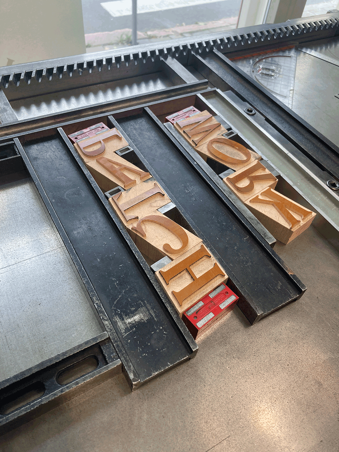
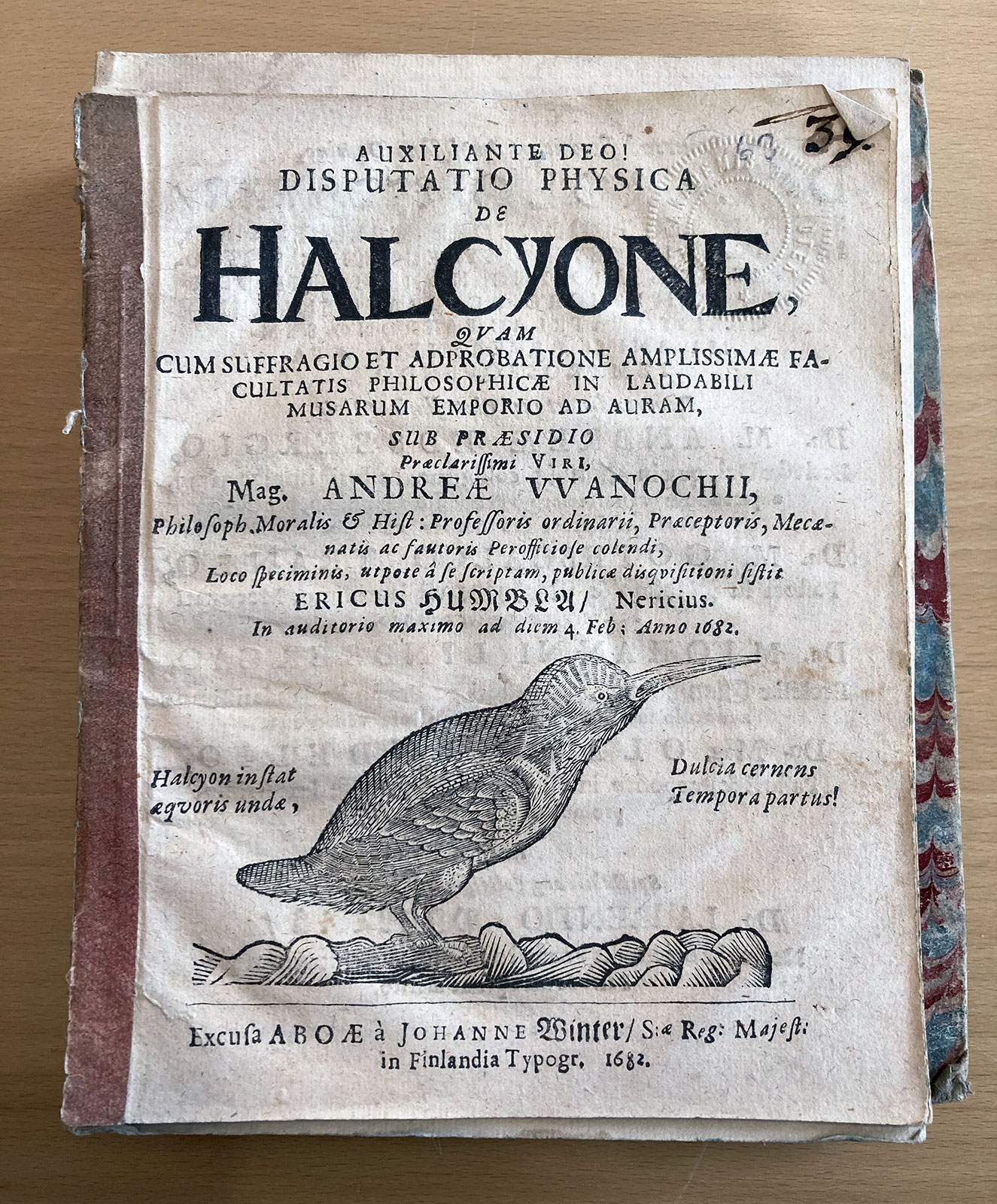
When the available fonts didn’t cut it, he resorted to carving his headlines manually from a single woodblock. The resulting prints are wonderfully wonky, and dive into forms of text that no typographic font could technically achieve. The most famous of these are probably the woodcuts produced for Ericus Humbla’s dissertation on the Kingfisher bird.
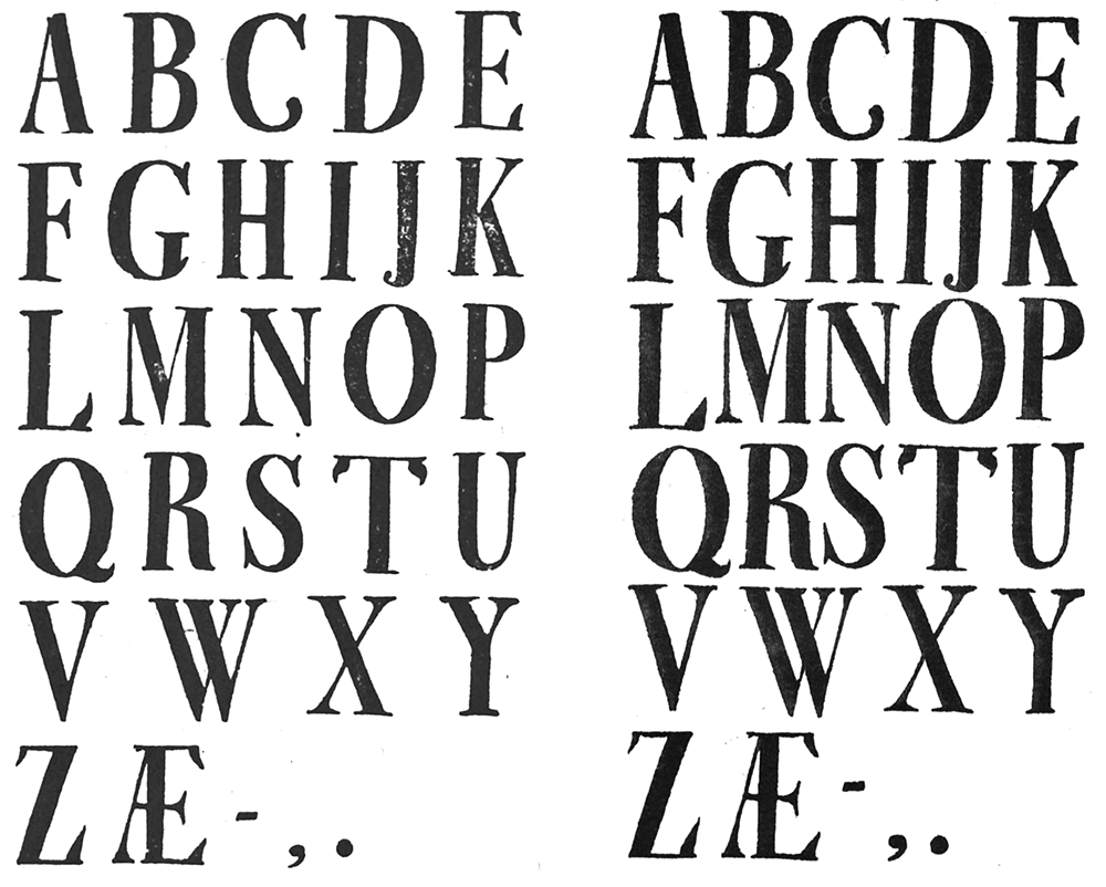
Johan Nicolaus Thun’s fonts first arrived in Turku around 1729 in the shadow of Johan Winter’s printing practice – initially as hand-me-downs from Swedish printers, but later resupplied directly from Lübeck by boat. The typeface is larger, heavier and more daring than the previous type in their arsenal. Baroque type designers embrace abstraction and mannerisms, and in Thun’s letters this comes across most obviously in the double-sided serifs, split endings and ornate detailing. The most dramatic and recognizable detail is the decorative leaf-like serif in the largest size.
Perhaps some of these details proved too strange even for Turku printers? As their type wore down from heavy use and resupplies were ordered from Lübeck, the design changed. These changes are more dramatic than what could be attributed to damaged type and uneven inking. Such variant forms often live side by side in the prints, making it all the more confusing for us.
Contemporary type design prefers logical systems and stylistic coherence. Making sense of Thun’s cacophony is quite the challenge, but this is exactly what makes it so interesting.